Import Libraries, Load Data
Load the required libraries to run the code.
library(ggplot2)
library(dplyr)
#>
#> Attaching package: 'dplyr'
#> The following objects are masked from 'package:stats':
#>
#>     filter, lag
#> The following objects are masked from 'package:base':
#>
#>     intersect, setdiff, setequal, union
library(coriplot)
library(tidyr)

data("remote_work_by_ed_level")
data("remote_work_by_ed_level_2021")
data("time_series_sample_data")
data("rural_urban_2021")
This applied the theme designed specifically for CORI and sets the defaults.
Single Line Chart Example
# For Single line chart, let's focus on Bachelors or Higher Education level
remote_work_by_ed_level_2021 %>%
  filter(education_level == "Bachelors or higher") %>%
  ggplot(aes(as.Date(date),
        pct_working_remotely)) +
  geom_line() +
  geom_point() +
  scale_x_date(date_breaks = "1 month", date_labels =  "%b") +
  scale_y_continuous(limits = c(NA, 0.51)) +
  labs(
    title = "Trend of working remotely throughout 2021",
    subtitle = "A single line chart example",
    caption = "Source: here https://www.placeholder.com") +
  xlab("2021") +
  ylab("Percentage %") +
  theme_cori() -> fig

fig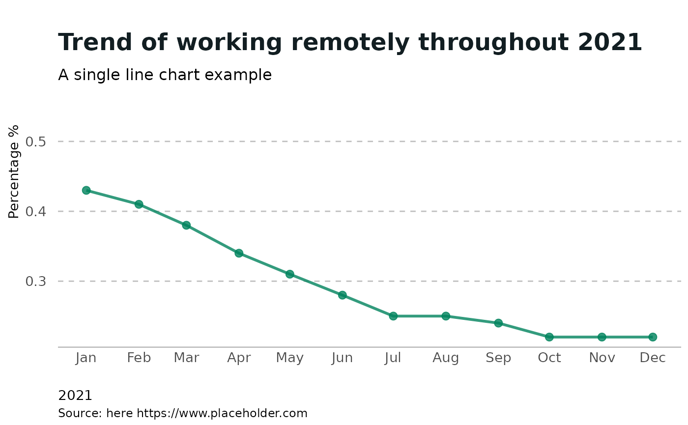
Multi Line Chart Example
remote_work_by_ed_level_2021 %>%
  ggplot(aes(as.Date(date),
             pct_working_remotely,
             group = education_level,
             color = education_level)) +
  geom_line() +
  scale_x_date(date_breaks = "1 month", date_labels =  "%b") +
  scale_y_continuous() +
  labs(title = "Trend of Education level in 2021",
       subtitle = "A Multi Line Chart Example") +
  xlab("2021") +
  ylab("Percentage %") +
  theme_cori() +
  scale_color_cori() +
  scale_y_percent() -> fig
#> Scale for 'y' is already present. Adding another scale for 'y', which will
#> replace the existing scale.

fig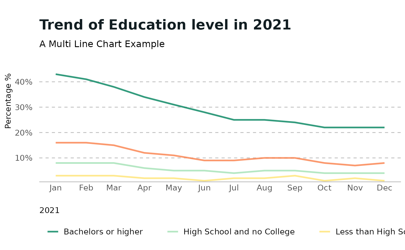
Two Line Chart Example (Secondary Palette)
In this example we will try to plot two lines for comparision with a secondary color paletter
fig <- rural_urban_2021 %>%
  ggplot(aes(as.Date(date),
             pct_working_remotely,
             group = education_level,
             color = education_level)) +
  geom_line() +
  geom_point() +
  scale_x_date(date_breaks = "1 month", date_labels =  "%b") +
  scale_y_continuous(limit = c(NA, 0.16)) +
  ggtitle("Line Chart - straight lines") +
  labs(title = "",
       subtitle = "Only 2 Columns")+
  xlab("2021") +
  ylab("Percentage Working Remotely")+
  scale_color_cori(cori_purple)

fig 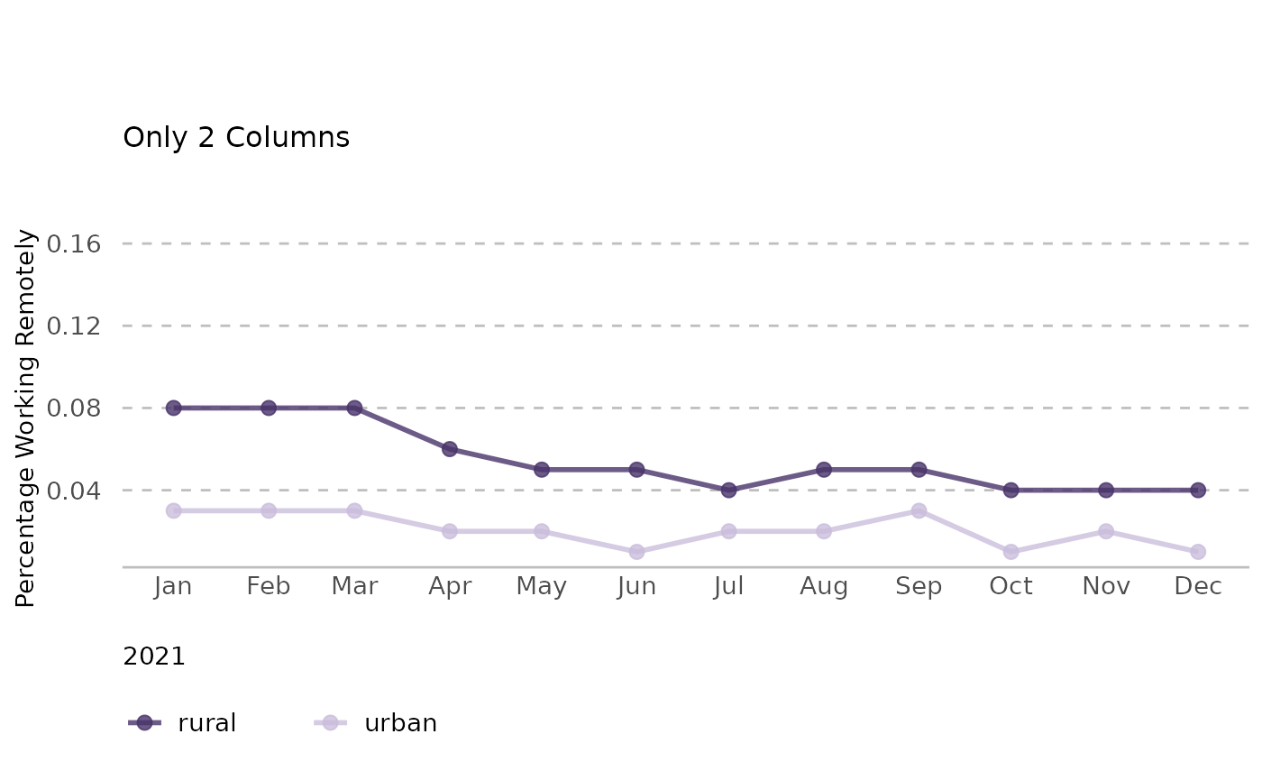
Faceted Line Charts Example
remote_work_by_ed_level_2021 %>%
  ggplot(aes(as.Date(date),
             pct_working_remotely)) +
  geom_line() +
  scale_x_date(date_breaks = "1 month", date_labels =  "%b") +
  labs(title = "Trend of Education level in 2021",
       subtitle = "A Multi Line Chart Example") +
  xlab("2021") +
  ylab("Percentage %") +
  theme_cori() +
  scale_color_cori() +
  scale_y_percent() +
  facet_wrap(~ education_level) -> fig

fig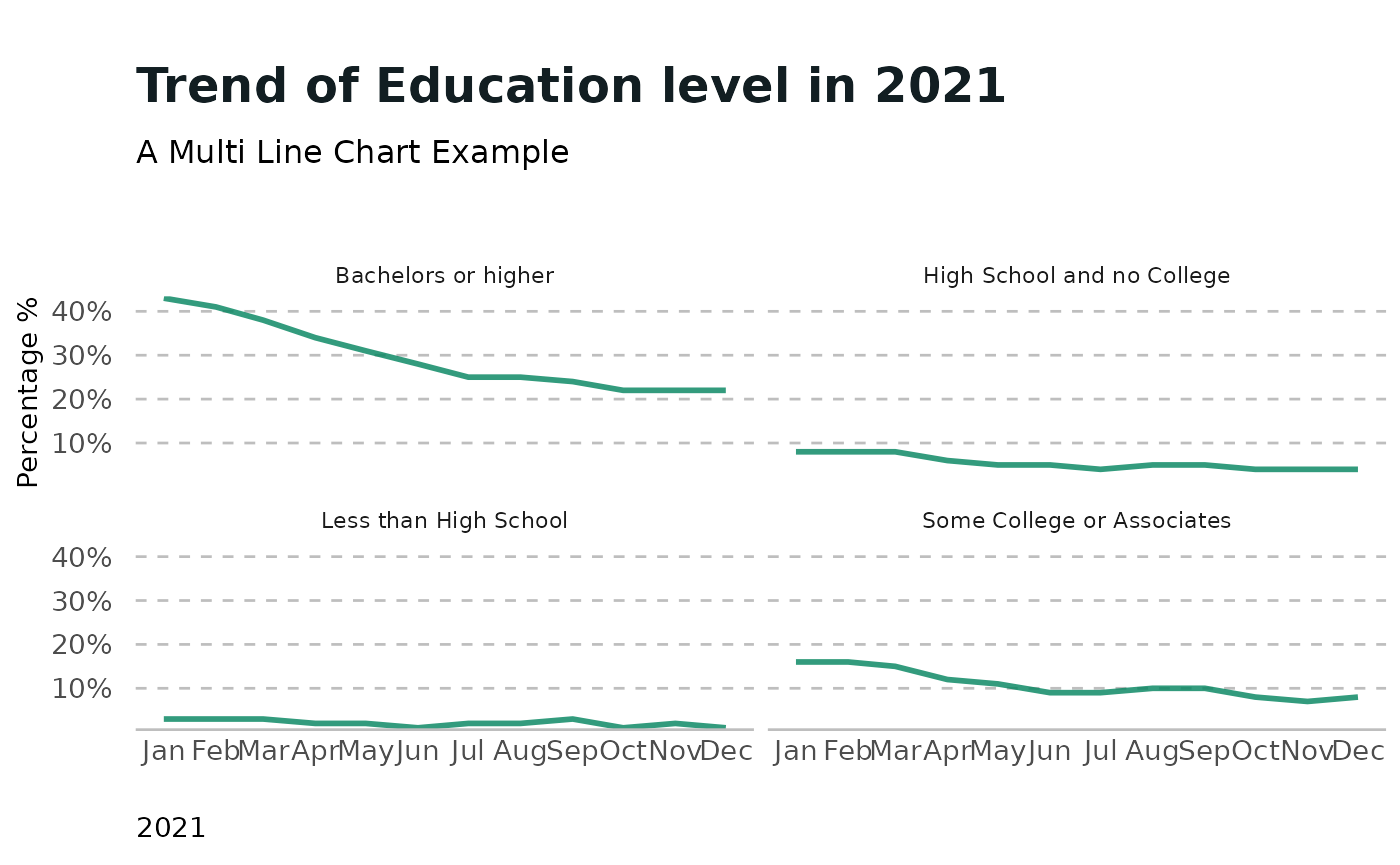
Multi Line Charts with Thresholds
remote_work_by_ed_level_2021 %>%
  ggplot(aes(as.Date(date),
             pct_working_remotely,
             group = education_level,
             color = education_level)) +
  geom_line() +
  geom_point() +
  scale_x_date(date_breaks = "1 month", date_labels =  "%b") +
  scale_y_continuous() +
  labs(title = "Trend of Education level in 2021",
       subtitle = "A Multi Line Chart Example") +
  xlab("2021") +
  ylab("Percentage %") +
  theme_cori() +
  geom_threshold_annotate(as.Date("2021-05-01"), axis="x", label="\n2021-05-01", shift=0.15) +
  scale_color_cori() -> fig

fig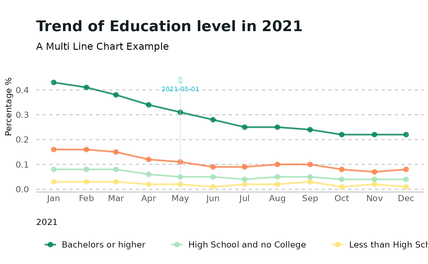
Watermark example
fig <- rural_urban_2021 %>%
  ggplot(aes(as.Date(date),
             pct_working_remotely,
             group = education_level,
             color = education_level)) +
  geom_line() +
  geom_point() +
  scale_x_date(date_breaks = "1 month", date_labels =  "%b") +
  scale_y_continuous(limit = c(NA, 0.16)) +
  ggtitle("Line Chart - straight lines") +
  labs(title = "",
       subtitle = "Only 2 Columns")+
  xlab("2021") +
  ylab("Percentage Working Remotely")+
  scale_color_cori(cori_orange) +
  watermark() -> fig

fig 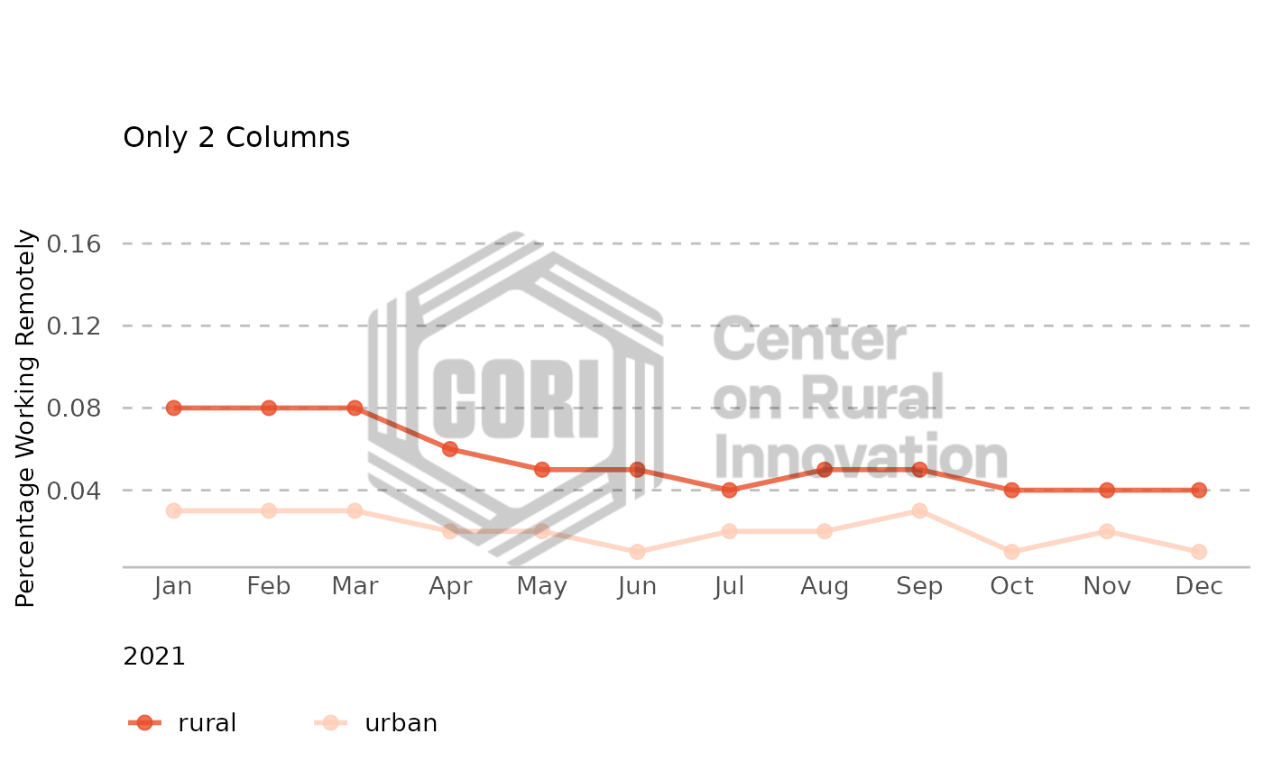
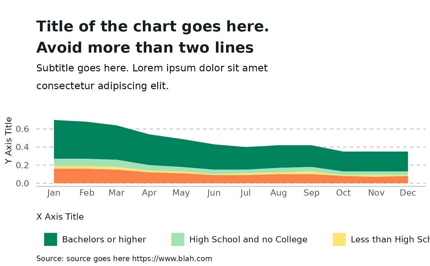
Area Plot
remote_work_by_ed_level_2021 %>%
    ggplot(
      aes(as.Date(date),
          pct_working_remotely,
          group = education_level,
          fill = education_level)) +
    geom_area() +
    scale_x_date(date_breaks = "1 month", date_labels =  "%b") +
    labs(
      title = "Title of the chart goes here.\nAvoid more than two lines",
      subtitle = "Subtitle goes here. Lorem ipsum dolor sit amet\nconsectetur adipiscing elit.",
      caption = "Source: source goes here https://www.blah.com") +
    xlab("X Axis Title") +
    ylab("Y Axis Title") +
    scale_fill_cori() -> fig

fig